There is no doubt charts and graphs are the best ways to represent some data in a graphical format so that becomes easier to understand. When it comes to creating graphs and charts we might need to create them for a number of situations, for example, at the time of showing the increase or decrease of some quantity in a company or organization which can be useful to understand the rate of growth. Besides that, there are a number of other graphs and charts, which can be useful to find out what an amount is out of another amount, and that can be useful to find out how much percent a number is out of another number and in other cases.
There can be innumerable situations when we might need to use charts and graphs to represent our data graphically. When it comes to Microsoft Excel, which is used to deal with huge volumes of data, you can even use charts and graphs to represent the data graphically. There are different types of charts and graphs, which you can use on Microsoft Excel to show the graphical representation of your data exactly the way you want and you can also customize it as per your requirements. From changing the colour to the dimensions of the charts, you can change almost every single thing with the chart that you create using Microsoft Excel.
So, without any further delay, let’s get started with how you can create a desired chart or graph for Microsoft Excel and also customize it as per your requirements.
Creating a graph in Microsoft Excel and customizing it
Here, we will create a graph that shows the sales figures in the numbers of a particular company and a simple chart displaying the sales numbers.
In a graph or chart, there are two most important points which are X-axis and Y-axis, and the independent variable is typically present across the X-axis, while the Y-axis will plot the output variable corresponding to the independent variable plotted against the X-axis.
In this chart, we will plot the year against the X-axis as the year is independent, and the sales numbers will be plotted against the Y axis, as it is dependent on the year.
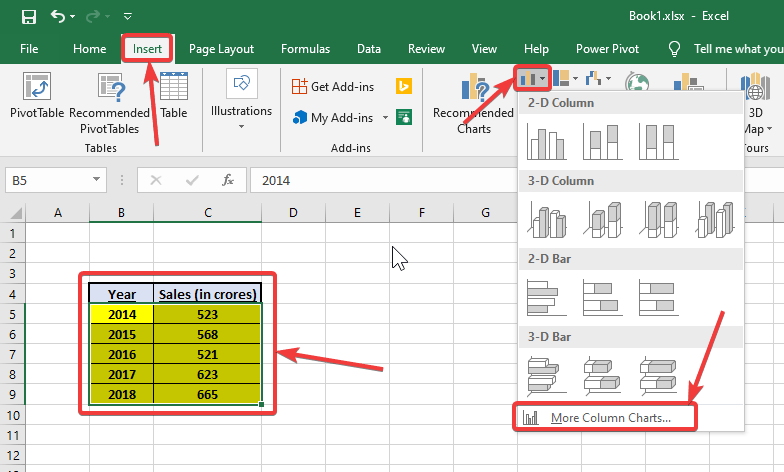
So, here is the data.

Creating a chart with an existing set of data
To create a graph, select the complete data that needs to be represented in the graph, click on the ‘Insert’ tab, and then click on the drop-down menu corresponding to the type of chart that meets your requirements. As it is a graph that will display the sales numbers, we will create a bar graph. To do that, click on ‘More Column Charts…’, under ‘Column Charts’, aka. Bar graph.

On the left panel of the ‘Insert Chart’ window, you can choose the type of chart that you want, and then go through the sub-categories on the top panel to choose the best graph that is required by you. You can cycle through the graphs to find out, how exactly they will look. You can finally select your preferred graph and click on ‘OK’ to apply the chart.

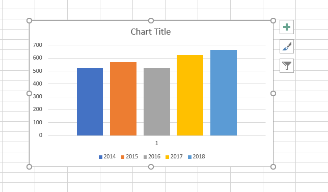
The selected graph will now be in front of you.

Customizing the chart on Microsoft Excel
You can customize the chart, change its name, as and when necessary. To customize the design of the graph, you can choose any graph by clicking on the ‘Design’ tab under ‘Chart Tools’ tab, after you select the chart that you want to customize.

To change the name of the graph, you just have to double-click on the ‘Chart Title’, and enter a name, which is ‘Sales numbers’ in case of my chart.

You can even change the colours of the bars within the graph, by clicking on ‘Change Colors’, and then by selecting the set of colours that you want. You can see a preview of the chart simply by hovering the mouse pointer across the multiple colour schemes available.

To change the chart type, without starting the process of creating a chart from scratch, you can click on ‘Change Chart Type’, and then choose the type of chart that you want. You can even click on ‘Select Data’, and ‘Switch Row/Column’ to change the set of data, or switch the row and column respectively, all under ‘Design’, under ‘Chart Tools’.

You can create several types of charts and graphs using Microsoft Excel, and each set of data can be used to create all types of charts that are available within Microsoft Excel. But, you should choose the best one depending upon the type of data you have.
For example, if you want to show the break up of your household expenses in different domains like foods, groceries, utility bills, and other miscellaneous expenses, it is best to represent it using a pie chart. To display the change (growth or fall) of a particular parameter, you can use the line graph, etc. So it is you, who should choose the best type of graph as per your requirements.
Different types of charts on Excel
However, if you are in a dilemma on which graph you should choose for the set of data that you have, you can click on ‘Recommended Charts’ under the ‘Insert’ tab and choose the most appropriate one.

Here are two more charts, the first one showing the household expenses of a family, in a month within a pie chart, and the second one are showing the number of wins of a team in a cricket match out of 5 matches, held from January to May in a web chart.

So, this way, you can create charts on Microsoft Excel, and the charts are highly customizable to make the same, look beautiful, as well. Do you have any questions? Feel free to comment on the same below.
- How to get a Microsoft Excel Worksheet within Microsoft Word
- How to protect Microsoft Excel sheets and encrypt them with a password
- Hide or unhide rows & columns in Excel
Related Posts
How to create email groups in Gmail? Send one email to multiple recipients in a matter of seconds.
Getting the right dashcam for your needs. All that you need to know
How to Install 7-Zip on Windows 11 or 10 with Single Command
How to Install ASK CLI on Windows 11 or 10
How do you install FlutterFire CLI on Windows 11 or 10?
How to create QR codes on Google Sheets for URLs or any other text elements