If you use spreadsheet programs like Microsoft Excel and Google Docs, you might already be familiar with charts. Creating a chart is a neat way to display some data within the sheet graphically, and a chart created using Microsoft Excel or any other spreadsheet program can also be exported to as an image file to be used elsewhere. However, if you have a lot of data within a sheet, and what you just want to find is the trend, creating charts will not always be useful. However, in that situation, you can use sparklines, which are not as colourful as charts but can be useful in a number of situations. If you know how to use sparklines, and know, what exactly they are, you might find it a good idea to replace most charts with sparklines while doing your everyday work.
Before talking about, where sparklines can be useful, let me first talk about, what sparklines are. Sparklines resemble charts within a single cell, and instead of showing you the data in a precise form that a chart does, it will display you the data in form of lines or bars to just let you know, which one is big, and which one is small; whether it is going up or down, and so on. As it requires only a single cell to show you the trend it doesn’t consume a lot of space. For example, if you want to show the increase and decrease in income of a company in twelve months from 2000 to 2019 in a single sheet, dedicating an individual chart for every single year will not only take up a lot of space but will mess things up. You can even print the document in a single sheet if necessary. However, with sparklines just consuming the space of a single cell, it can easily be printed out in a piece of paper.
So, let’s find out, how you can create sparklines on Microsoft Excel on Google Sheets, which are the two spreadsheet programs of choice for most users.
So here, I will create one set of data, that will show the income of a company in the 12 months from 2015 to 2019.
Then I will create two sparklines, one showing the increase and decrease, in the form of line-based sparklines and bar-based sparklines.
So here is the data.

On Microsoft Excel
- After you have entered the data in Microsoft Excel, select the cell, where you want the sparklines corresponding to the data. Now click on the ‘Insert’ tab, and then click on the ‘Line’ icon, under the ‘Sparklines’ frame.
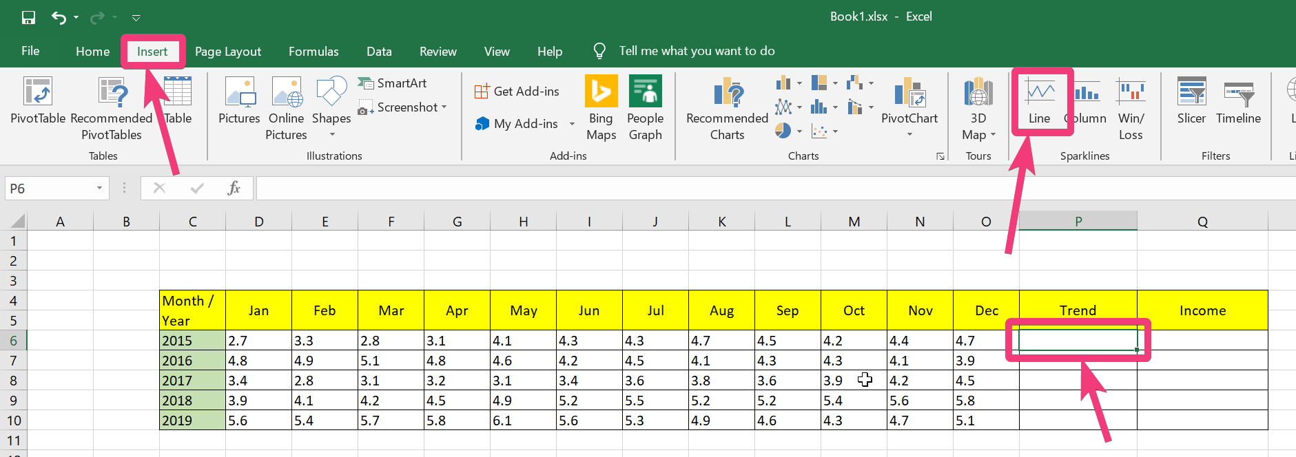
- Now, select the cells containing the data that you want to represent using Sparklines. You can simply enter the range of cells or just type in the first cell and the last cell with a ‘:’ in between, as shown in the screenshot below. Finally, click on ‘OK’.

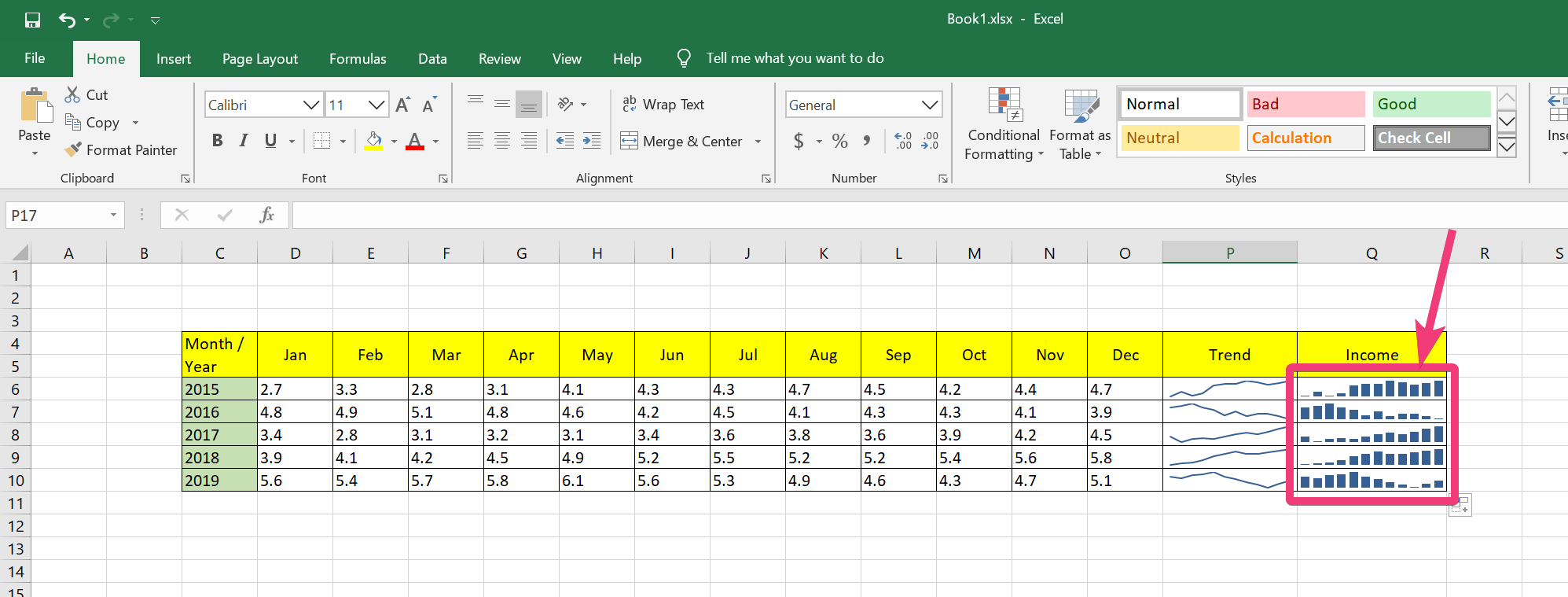
- Now, the sparkline for the selected set of cells will be displayed in the cell selected by you. Just use the green dot at the corner of the cell to apply the same for the next set of data.

- You can also click on the ‘Column’ button and get a column-based sparkline in a cell, as shown below. The process is exactly the same to create column sparklines, as well.

- As sparklines take up very little space, customization options are highly limited. However, you can change the colour of the lines, and highlight the first and last points, lowest and highest points, etc., by choosing ‘Marker Color’ under ‘Design’, by selecting the cells containing the sparklines.

On Google Sheets
I am just using the same data on Google Sheets. After you have entered the data set in a sheet, select the cell, where you want to see the sparklines.

Now, in the formula bar, just write the formula to create sparklines. Here is the general formula for creating sparklines on Google Sheets.
=SPARKLINE(range,{“charttype”,”bar/column/line”})
You can even enter additional arguments for colours, minimum and maximum values, etc., but the general formula that I have given here will mostly be important for you.
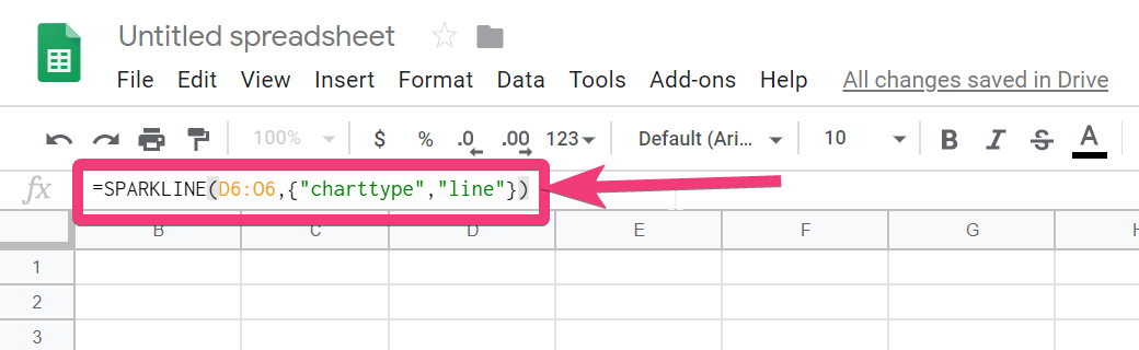
Now, for me, the formula for creating a line-based sparkline will be as follows, and the sparkline corresponding to the entered formula is also displayed below.
=SPARKLINE(D6:O6,{“charttype”,”line”})

On the other hand, if you want to create a column-based sparkline, the formula will be slightly different, and the corresponding output is also shown below.
=SPARKLINE(D6:O6,{“charttype”,”column”})


Just like in Microsoft Excel, on Google Sheets, as well, there are options for customization, but you need to know the corresponding arguments for each of them.
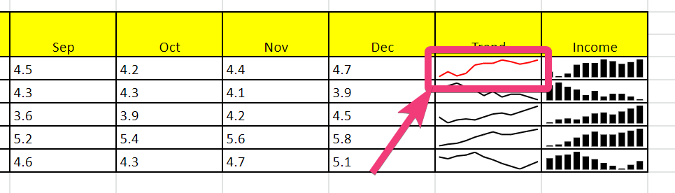
So, here is an argument that will change the color of the line graph, with the ‘color’ argument. Here is the final formula, with the output for the same with the additional ‘color’ argument.
=SPARKLINE(D6:O6,{"charttype","line";"color","red"})

To know about more arguments that you can use for customizing your sparklines on Google Sheets, you can see this link. Use of sparklines is the best and the most concise way to represent a set of data graphically without consuming much space.
Do you have any questions about sparklines? Feel free to comment on the same below.
Other Articles:
- Protect Excel Sheets with Password
- How to translate documents into different languages in google docs
- Hide or Unhide rows and column in Excel
- How to use conditional formatting in Microsoft Excel
Related Posts
How to create QR codes on Google Sheets for URLs or any other text elements
How to create data bars in Microsoft Excel for numeric values
How to dynamically adjust column width in Microsoft Excel based on cell contents
How to do a scatter plot in Google Sheets? Easily represents the correlation between numerical values
How to Record a Macro in Google Sheets and run it whenever necessary
How to combine first name and last name or split a name in Google Sheets