Make beautiful full of colours charts and graphs in Google sheets such as Line graph or Line chart, Pie graph, Scatter graph, Map graph, Histogram and more.
Google Sheets is a part of Google Docs an online office suite which provides not only Spreadsheet but also Word processor, Slides to handle presentations and Forms for surveys. It is a rather good online alternative to Microsoft office for quick access to Spreadsheets and Documents.
Google Doc Spreadsheet is not just a free online program that allows you to access, create and edit you Spreadsheets or excel files, it is more than that. It has a wide range of support for functions and formulas, all day to day options that a person requires to handle a spreadsheet, a wide variety of budgets, schedules, and other pre-made spreadsheets templates, Sharing of sheets among multiple users for Team collaboration, pivot tables and conditional formatting options, colorful charts and graphs; artificial intelligence support to generate automatically data graphs/charts, pivot table, and more…
Google Sheets graphs or charts are so simple to create, even a person without any previous knowledge of Google Docs can create online charts with just a few clicks.
For storing files online the Google Docs uses the Google Drive which is deeply integrated and offers 15GB space or depends upon your account. However, at free of cost, it is more than enough. Thus, let’s see the main topic of this tutorial which the way to create different Graphs and Charts on Google Sheets such as Line graph, Area graph, Column graph, Bar graph, Pie graph, Scatter graph, Map graph, Timeline chart, Table chart, Treemap chart and others.
Make a line graph or chart in Google Sheets
Trivia: The steps to create a Line graph in Google Sheets is also the same for other graphs such as Area graph, Scatter graph/chart, Map graph etc.
Step 1: Open Google Sheets for creating a graph
The first step is to open and access Google sheets and for that, you must have a Google account. You can either search for Google Sheets on any search engine or use this link.
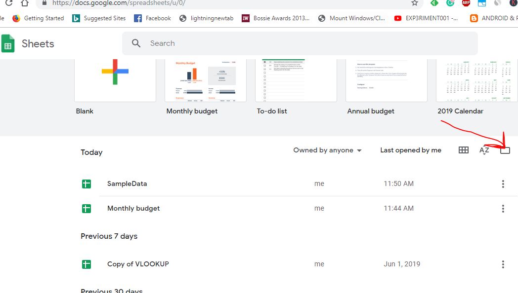
Step 2: Import your Spreadsheet to Google Sheets
If you have a large amount of data on your Spreadsheet then it’s better to upload that in Google Sheets rather copy and paste it directly to sheets. To import files click on the folder icon given on the right side.
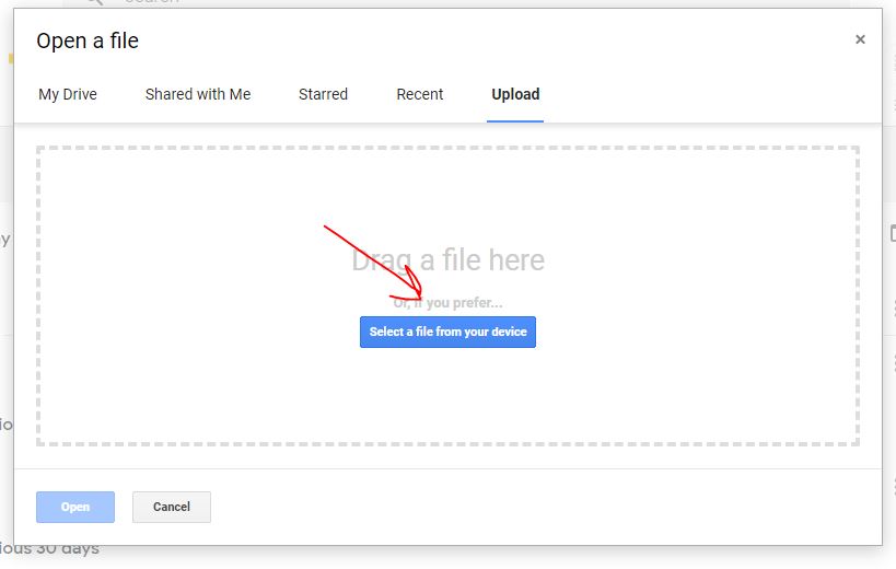
And when a pop-up will appear, select the upload tab and either drag & drop your file or click on the button “Select a file from your device” to upload a file.
After uploading, the file will appear on Google Sheets, click to open it.
Step 3: Create a Chart in Google Sheets
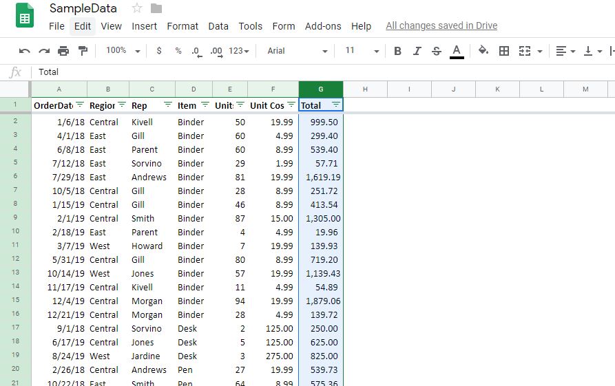
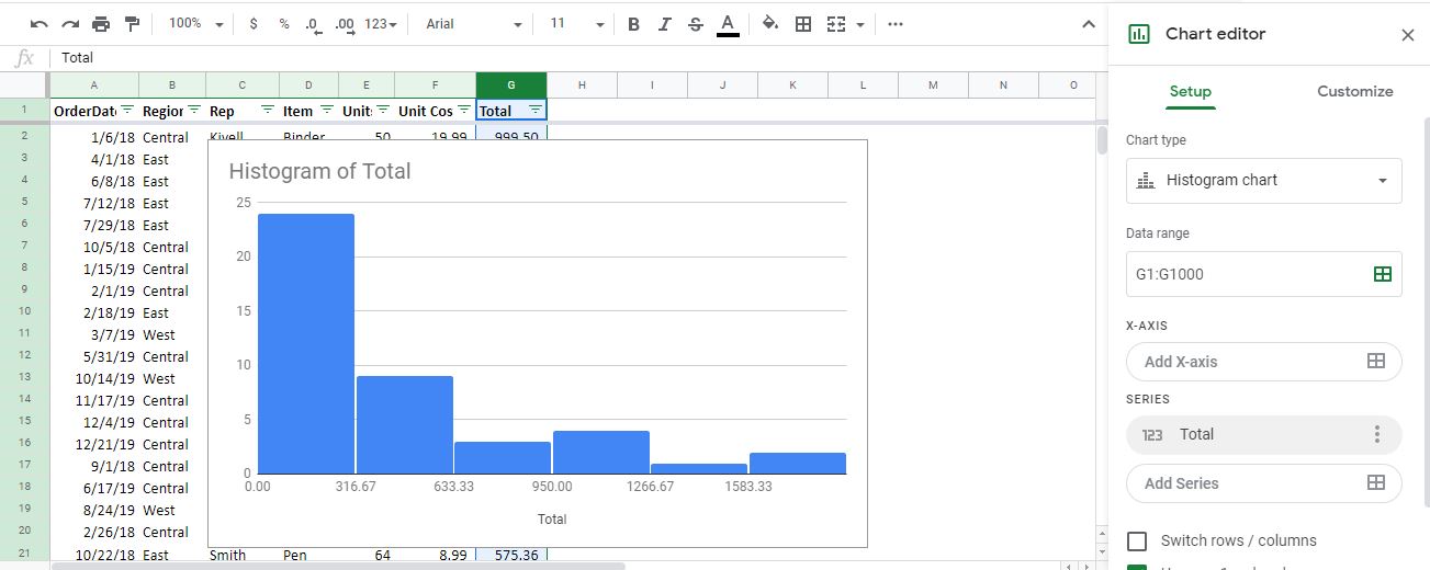
To create a Chart, first, you have to select the data range for which you want Google sheets to create graph or Chart. For example, in the below sheet, we have selected a complete data range of G column i.e Total.
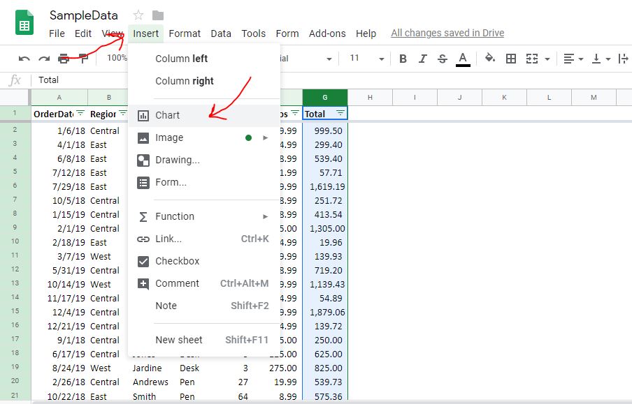
After data selection, go to the menu of Google Sheets and select Insert and the Chart.
Step 4: Create a Line graph in Google Sheets
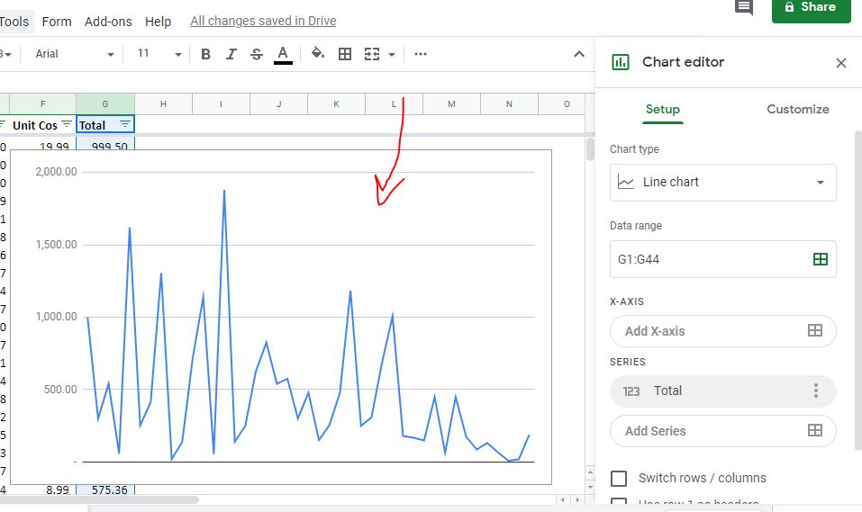
The Chart option will give some random chart type for your selected data based on Google Machine learning suggestions. As you can see in the below image we got Histogram chart. However, to change it and get a Line graph you have to go to the Chart editor available on the right side.
In Chart Editor, select drop-down box given under Chart type and then select the Line graphs. There are three types of Line Chart- Standard Line Chart, Smooth Line Chart and Combo Chart. Select the one you need.

Step 5: Display Line graph or chart
As you select prefer line chart, the graphical view of your data in the form of the graph will appear on the left side above the data in a free-floating form.
Step 6: Add additional information to Line graph
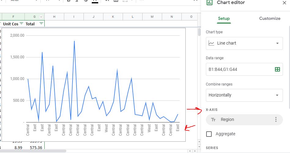
By default, there will be no Vertical axis info like you see in the above screenshot but you can add that. Click on Add X-axis option from the Chart editor and select the range of data that you want to appear on the X-axis of the Chart or graph.
Step 7: Add Additional Range to graph
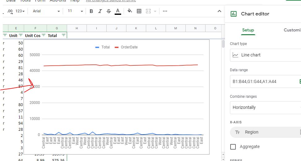
After creating a Graph you can even add additional data range. For that click on the Data range option box from the Chart editor and then Add the new data range you want to show on Line or any other graph.

Step 8: Customization of Graphs in Google Sheet
Furthermore, we can customize the Graph elements such as background colour, Font, Smoothness of lines, Size of the chart, axis titles, chart header, Gridlines and a lot more. For that just click on the Customize tab of the Chart editor and start styling your Chart or Graph.

Step 9: Auto Generation of Charts or graphs on Google Sheets
If you don’t want to create a chart or graphs manually on Google Sheets then there is one more method that uses Google’s Machine learning algorithm to create graphs and give other suggestions automatically.
To use that just click on the Explore button given on the bottom right side of the sheet and everything will be on your tips.

In the same way, we can create any kind of line charts or line graph including other available on Google Sheets.
Other Articles to read:
- How to use Google Sheet Data Analysis
- Tutorial to use Google docs voice transcription feature
- Way to use offline the Google Docs and other Google office suite apps
Related Posts
How to create QR codes on Google Sheets for URLs or any other text elements
How to set Gemini by Google as the default Android assistant
How to do a scatter plot in Google Sheets? Easily represents the correlation between numerical values
Google’s new AI Content Moderation Policy for Play Store Apps
How to Record a Macro in Google Sheets and run it whenever necessary
How to combine first name and last name or split a name in Google Sheets