Data Analysts and Scientists always require visualizing their data to see the variations present in the dataset and also to give a clear picture to the interested party what they are working with will give what type of inference. It is of utmost importance for every Data Analyst to have prior knowledge of Data Visualization techniques.
Now, the question arises that how to perform Data Visualization in the computer system and that too efficiently?
The answer to this question is using specialized data visualization tools like MS Excel, Tableau, Power BI, programming languages, etc. The best and most used among these tools is the Python Programming language. This language has many built-in libraries that are self-capable of analyzing the data by using certain formulae and then plotting various kinds of graphs and glyphs.
One such library is the Seaborn library for Python. This is a very strong library that is a high-level API built on top Matplotlib library of Python and easily generates various graphs by consuming a lesser amount of time. The dataset that is drawn fresh as a CSV, xlsx, or any other file format has some kind of categorical and numerical columns present and these columns need to be visualized properly to see the semantic relationship with the target variable.
Therefore Seaborn helps in visualizing both categorical and numerical columns and the different types of plots that can be visualized with the help of Seaborn library are given below:
Visualizing the Categorical Columns
There is a provision to visualize categorical features in Seaborn and the different types of categorical plots that can be plotted are:
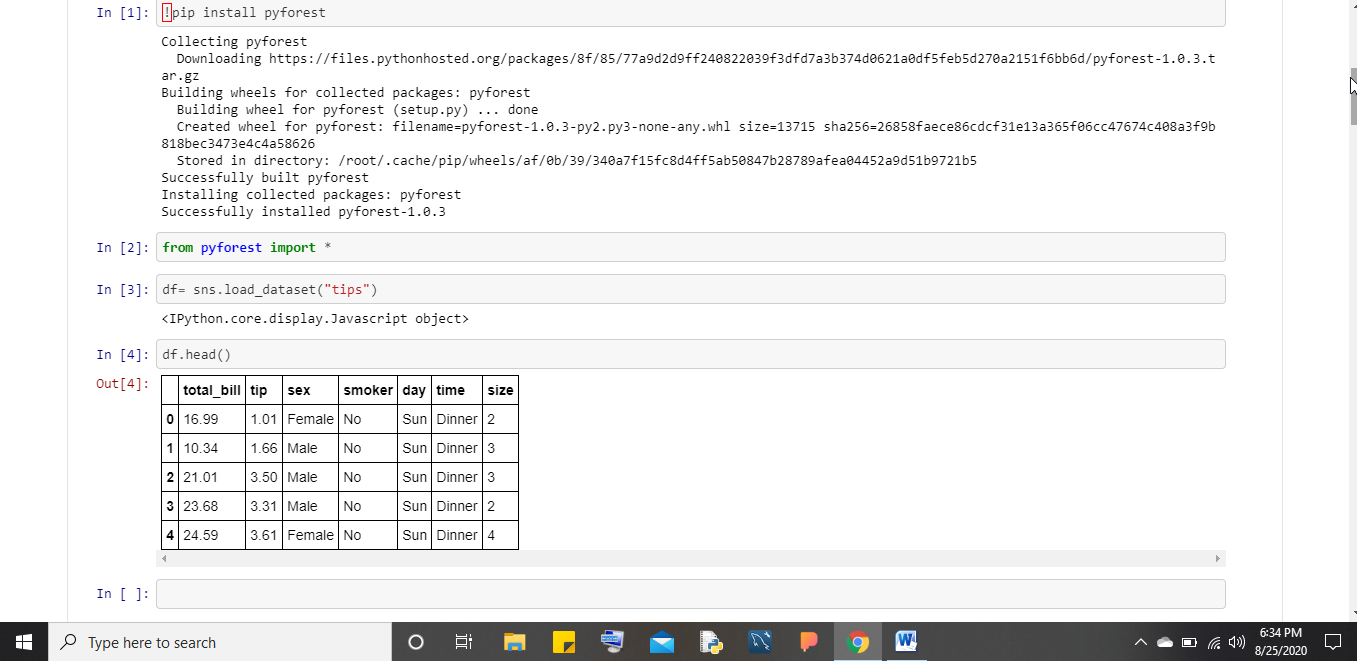
Count Plot
This type of plot can be performed with one categorical column as it helps in giving us the count of metadata contained in the column. The way to call the count plot function using Seaborn is given below:
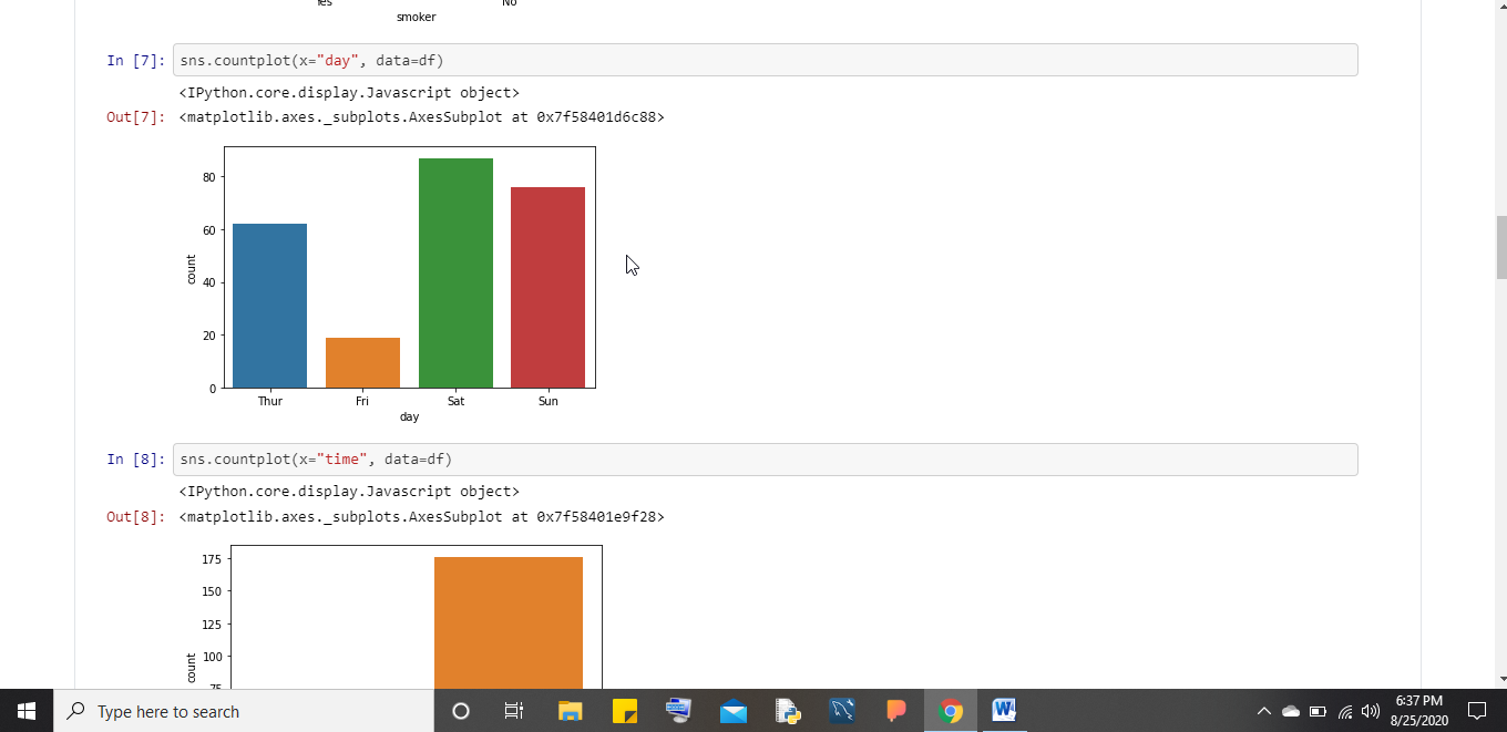
Bar Plot
This type of plot is very much similar to Count plot the only difference is that it accepts both x and y coordinates to be specified that is visualizing the categorical features concerning some numerical features. The way to call Bar plot is given below:
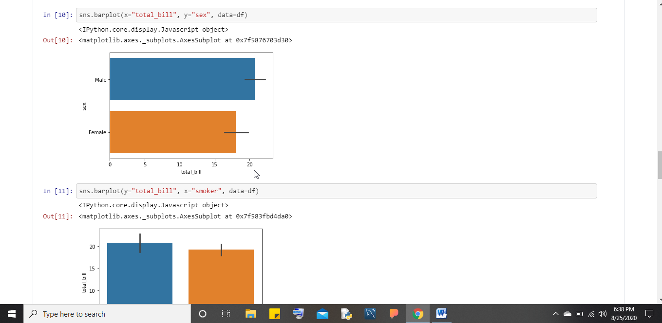
Box Plot
This plot helps users to get the percentile value of certain categorical features concerning numerical features. A percentile (or a centile) is a measure used in statistics indicating the value below which a given percentage of observations in a group of observations fall. For example, the 20th percentile is the value (or score) below which 20% of the observations may be found. The way to call Box plot using Seaborn is depicted below:
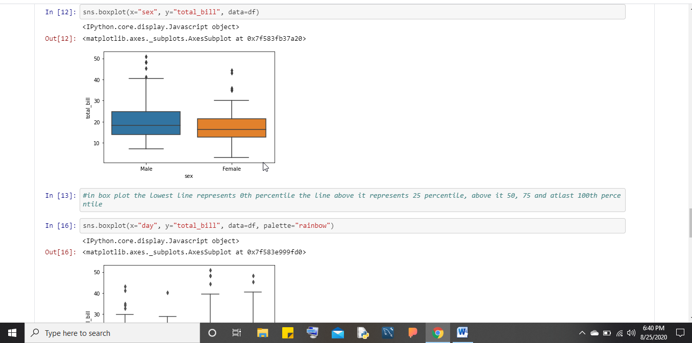
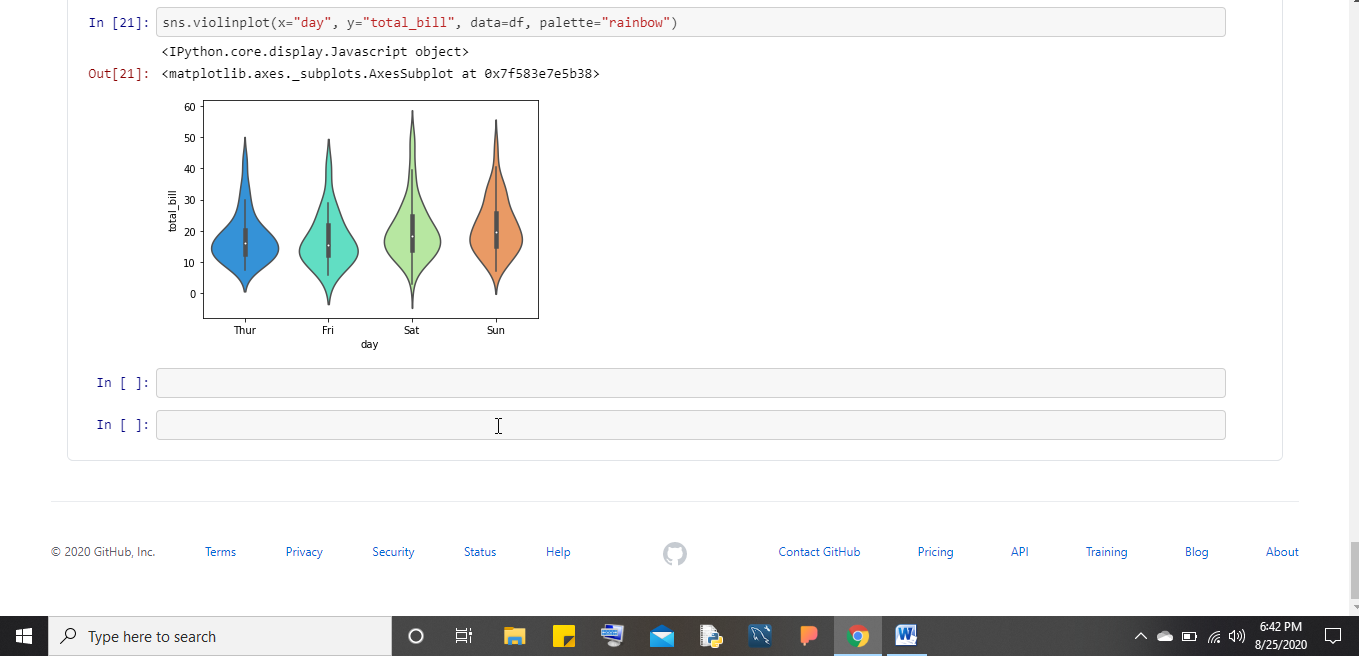
Violin Plot
This is a specialized case of Box plot where visualization is given based on Box plot representation as well kernel density estimation between categorical features and numerical features. The way to plot a Violin plot is depicted below:
Visualizing the Numerical Columns
For visualizing the numerical columns Seaborn provides different types of graphical representation and some of them are:
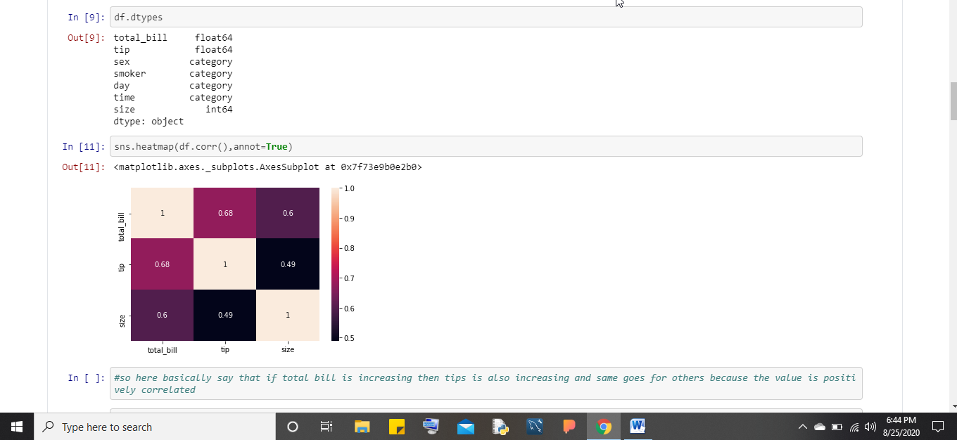
Correlation
Correlation basically tells the correlation between every feature with one another. A correlation map uses colored cells in a monochromatic scale to show a 2D correlation matrix between two discrete dimensions or event types. It plays a pivotal role in feature selection. Correlation can only be found out if our dataset contains integer or floats and not categorical features (strings). The way to plot correlation using Seaborn is depicted below:
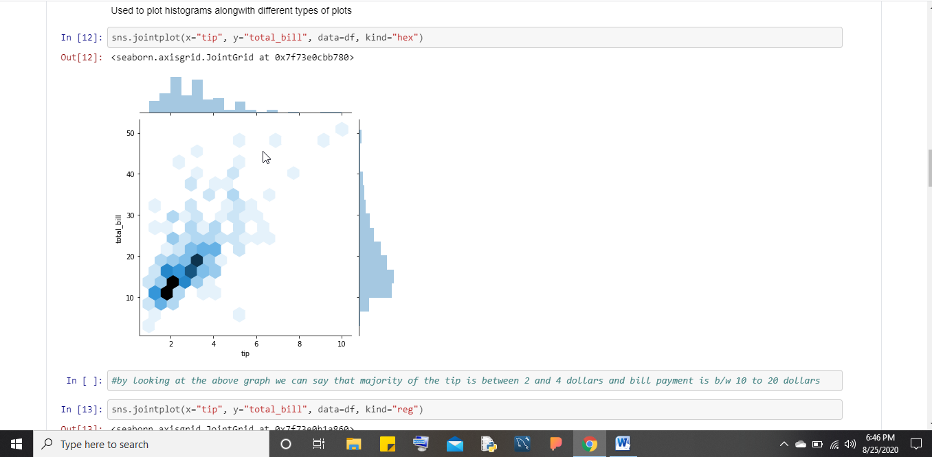
Joint Plot
It is a specialized type of plot that shows the fluctuation of one numerical feature with others. It has many different types of representations and to plot the same using Seaborn take a look here:
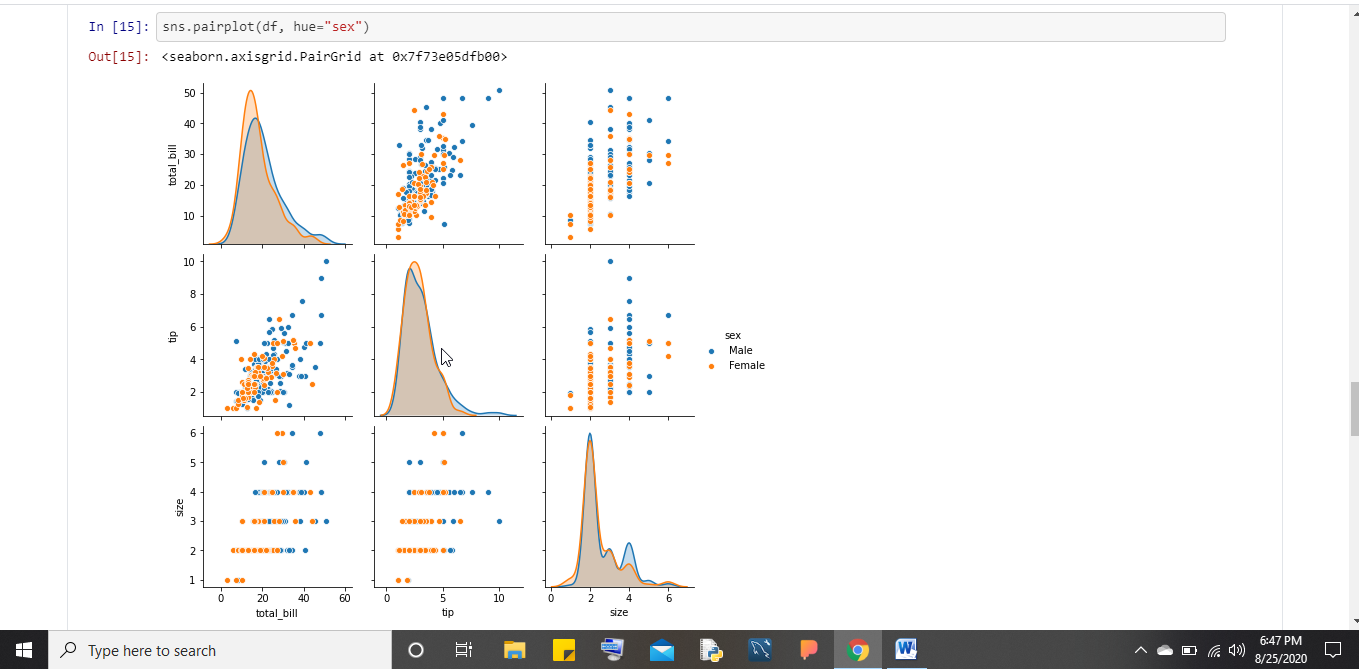
Pair Plot
A Pair plot is also known as a scatter plot in which one variable in the same data row is matched with the value of another variable. The way to plot Pair Plot using Seaborn is depicted below:
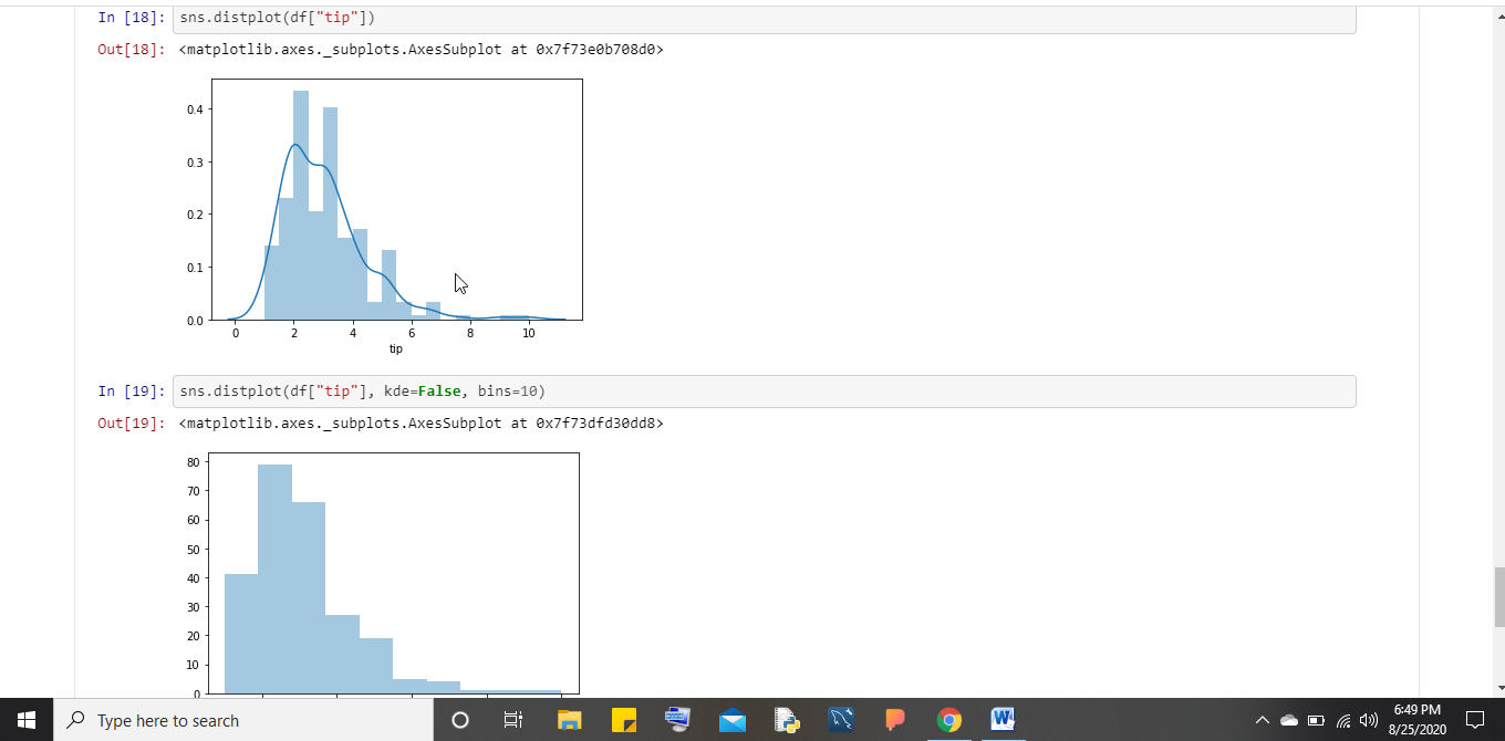
Dist Plot
Dist plot helps us to check the distributions of the columns feature. KDE Plot described as Kernel Density Estimate is used for visualizing the Probability Density of a continuous variable. It depicts the probability density at different values in a continuous variable. We can also plot a single graph for multiple samples which helps in more efficient data visualization. The way to plot the same is given below:
Conclusion
With the help of Seaborn, Data Analysts find it very easy to visualize their dataset for both categorical as well as numerical features. So grab this opportunity to work with this amazing library of Python and start building beautiful graphs from now to gain respect and fame in your organization.
Read more:
- What is data analytics? Different ways of data analysis to make lives easier
- Data visualization tool review of Navicat Premium 15- Create charts and reports
- Various tools required for carrying out Data Analysis & Machine Learning in Python
Related Posts
AirGo Vision- Solos’ Smart Glasses with AI Integration from ChatGPT, Gemini, and Claude
Rise of deepfake technology. How is it impacting society?
OpenAI’s Critic GPT- The New Standard for GPT- 4 Evaluation and Improvement
Claude 3.5 Takes the Lead- Why It’s Better Than GPT-4
Smartphone Apps Get Smarter- Meta AI’s Integration Across Popular Platforms
Free PDF Analysis Made Easy with ChatGPT