From everything that we see on the world wide web to our credentials in our office, everything is possible due to databases, which is responsible for keeping our data in an organized way to make it easier for people to understand and make it easier to troubleshoot when it is necessary. The concept of a database is not something that most people will be able to see when they are on a website or is using an application. The database is something that runs in the background and makes everything possible in the front end. However, sometimes we need to present the data within a database is in a presentable way for different requirements.
Sometimes we need to create presentations where we might have to show the increase in the performance of the employees or show, how much the sales have pushed up, and have eventually risen in the profits. There are literally unlimited circumstances when we need to present our data in the form of charts and tables so that it becomes easier for people to understand and draw a verdict. When it comes to creating a chart from a table or database, it isn’t an easy exercise, and you might require the power of multiple programs to do that. But not any longer with the Navicat Premium 15 Data Visualization tool. It is quite some time now that I am using Navicat Premium 15 Data Visualization tool for creating charts and tables from my existing databases, and I am here with the review. Navicat Premium 15 Data Visualization tool is actually a data visualization tool that can be used to visualize your data in different ways exactly the way you want.
So, without any further delay, let’s get started with the review of Navicat Premium 15 Data Visualization tool.
Features:
Let’s start with the features of Navicat Premium 15 Data Visualization tool to help you understand the possibilities of the tool.
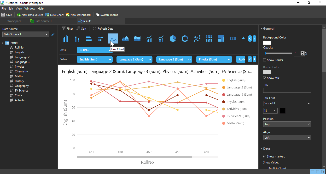
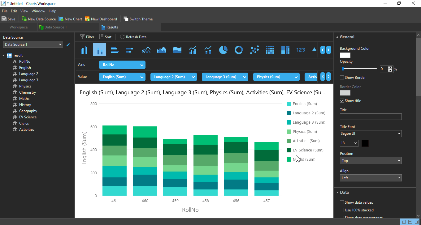
- With the data visualisation tool of Navicat Premium 15 Data Visualization tool you can create different types of charts, which includes vertical and horizontal bar charts, vertical and horizontal stacked bar charts, line charts, area charts, pie charts, donut charts, heat map, treemap and different other charts, including the combination of two or more charts, as and when necessary.
- With the data modelling tool, you can find the live reflection of the data, if the database you are connected to is getting updated from remote sources. There is also a way you can find archive data instead of real-time data, which can also be useful if you want to find the day end data or want to see the data after certain intervals, and don’t want to get them updated real-time at the brink of preparing a report.
- After you have added a new data source to create your chart, or you have prepared multiple charts, depending upon how many data sources and tables you have, you can put all those charts within a dashboard so that you can have a quick look over all the charts that are prepared by you, from your existing database and the tables.
- The charts can be prepared with a bright white or dark black background. After you have chosen a new theme, the look and feel of the charts will be changed at the same time to make the charts be on par with the chosen theme.
So, these are the major features of the data visualization tool that is available within the Navicat Premium 15 Data Visualization tool.
For visualizing data, you have to first prepare a chart, which I will discuss here.
I am considering, you already have a table, which is a part of the database and Navicat Premium 15 Data Visualization tool it has a proper existing connection with the database.
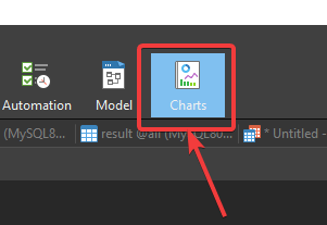
If all the conditions are fulfilled, click on ‘Charts’ in the toolbar.
Now, click on ‘New Workspace’.

After the ‘Charts Workspace‘ opens up, you will have to add a new data source by clicking on ‘New Data Source’.

Now, name the data source, and choose the connection for the data source, and click on ‘OK’.

Next, you can find all the databases in the selected server, on the left panel, in an explorer view. Just expand the database, where you have the tables that will be the source for the chart source. For me, it is the database ‘all’, and the data source is ‘table_1’. Just drag and drop it in the workspace. After that, click on ‘Apply and Refresh Data’.

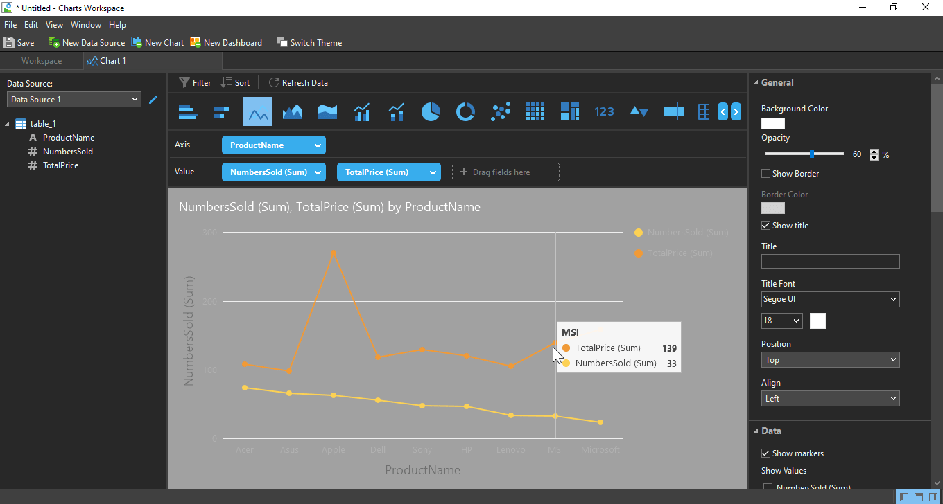
The content of the data will be displayed to you. Now click on ‘New Chart’.

You have to assign a name to the chart and keep the default data source. Now, click on ‘OK’.

Lastly, just drag and drop the fields that correspond to the axis and the value. For me, the axis will be ‘ProductName’, and the value will be ‘NumbersSold’. Just drag and drop them in the respective areas.

The final chart is now in front of you.

This way, you can create multiple charts as per your requirements, and you can later put all of them within one or multiple pages on the dashboard.
Pros
Now, let’s have a look at the pros of the data modelling tool that is available within the Navicat Premium 15 Data Visualization tool.
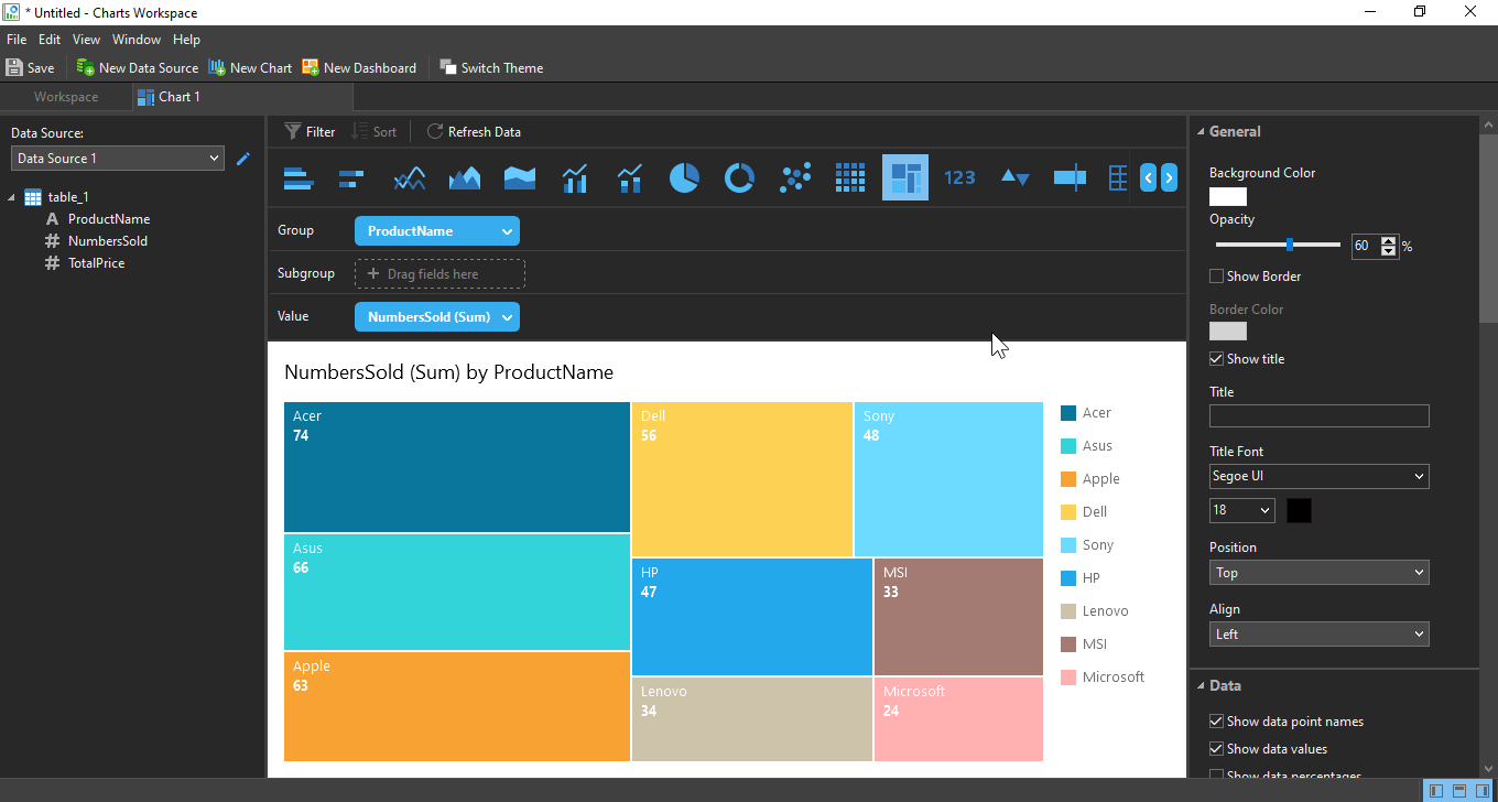
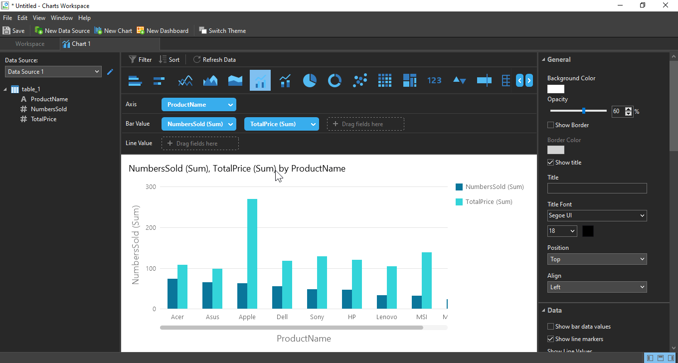
- After the table is prepared by you and you have hence prepared your chart, you are free to change the type of charge that you have created, or create multiple charts from the same set of data to represent it in different unique ways as per your requirement at the time of a presentation or for preparing a report.
- As I have discussed in, how to prepare a chart, you can customize the chart in different ways, add text, labels to it, change the colour, font style and the position as per your requirements. If you are familiar with Microsoft Excel and also the ways to create charts in Microsoft Excel, you can find all the similar features and you can even place the values on top of the data or at appropriate places if you find it important. You can even change the colour scheme of your charts to make them look more vibrant.
- As you can see in the screenshot below, I have prepared multiple charts that are displaying the number of units of laptops sold by different leading companies, and the selling amount in a different chart.

I can even create a few more charts to show, which brand has delivered the maximum profits, show a breakup of the market share and do a lot more. In the dashboard, you can place all the charts and print it out and that will be as good as preparing a report in a separate program. So, besides helping you with data modelling, Navicat Premium 15 Data Visualization tool can also be useful in helping you prepare beautiful and eye-catching reports that will definitely impress your seniors.
Here are a few other charts which I have prepared during the review of the Data Visualization tool of Navicat 15.


- Dealing with charts to create a beautiful visual data model in Navicat Premium 15 Data Visualization tool is really a child’s play as long as you are having a successful connection with an existing database. Even though the features are kind of limited when it comes to data modelling on Navicat Premium 15 Data Visualization tool, the existing features are not disappointing at all, and the absence of trivial features will not confuse any new user using the software for the first time. It comes with only those features that you will ever need to create charts and dashboards.
- After the charts are prepared by you, you can save the individual charts as external files, which can later be opened with Navicat Premium 15 Data Visualization tool so that you can make some modifications to it with an updated set of data or if you want to add some more charts to it. This can be really useful if you want to deal with the charts later on, and you want to update the table with the changes within the table in the remote database.
So, those the pros of using the data modelling tool available within the Navicat Premium 15 Data Visualization tool.
Cons
Now, let’s have a look at the cons of using the data modelling tool available within the Navicat Premium 15 Data Visualization tool.
- Even though you can save the chats in an external format, it can only be saved in ‘.ncharts’ format, which is a format that is only supported on Navicat Premium 15 Data Visualization tool. So, if you want to export it to some other program like Microsoft Excel, PowerPoint you can do that, but in a different way. You will have to print the chart or dashboard as an image file which can later be used for other purposes. I just wish, the option to export the charts or dashboards was possible at the time of saving the chart or dashboard as an external file.
- There is no way, you can set an interval to refresh the data from the server. You will always have to refresh the data manually by clicking on the ‘Refresh Data’ button. Even that can be useful, if you do not want the chart to get updated every time, after a certain interval of time, which can also save bandwidth, but an automatic refresh of data can also be useful for many users. I wish, Navicat Premium 15 Data Visualization tool just gives the option to set an interval of automatic data to refresh and allow the users to choose what they want.
- This is not a con, but I wish there were a few more types of charts, like radar chart, surface chart, scatter chart, and a library for different types of 3D charts, which are still missing. Even though the existing chart options should cater to all types of users, the availability of different types of charts would have made this data visualization tool of the Navicat Premium 15 Data Visualization tool more useful.
So, those were the cons of using the data visualization tool that is available within the Navicat Premium 15 Data Visualization tool. I am sure, all the cons I have mentioned here can easily be fixed with future updates to the software.
Bottom line:
If you are not a noob in the world of dealing with databases, you might already know how troublesome it is to deal with databases, and data entry with different types of software available, and using a different software again to create reports. You might be using a number of other programs to create reports, but from time to time most users face problems with SQL connection errors and sometimes you might not get exactly what you want, with your existing set of tools. However, with the data visualization tool of the Navicat Premium 15, you can even create reports, present them exactly the way you want. If you want to add some finishing touch to your projects and reports, you can depend on some third-party programs after the main thing is ready. Using one software for all your requirements will definitely boost your productivity, and thus, I will definitely recommend the data visualization tool of the Navicat Premium 15 Data Visualization tool to sort everything from data modelling to creating reports with just a single piece of software.
So that was my review of the data visualization tool available within the Navicat Premium 15 Data Visualization tool. Do you know any other great features that I have missed or want to say something about the software? Feel free to comment on the same below.


Thank you, very useful stuff. I was thinking of inserting graphs in my admin panel but since I can visualize this data directly in Navicat, why bother.