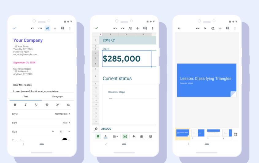
Well, where at one side Google keeps working on its new version of Android and rolling out of dark mode in supported apps amid them it has recently announced on its blog the improved interface of Google office apps that are Google Docs, Sheets and Slides.
Google has refined its office apps’ interface and now they look more smooth with the implemented material theme. Just like the interface of the Google Play store, the surface of Google Docs, Sheets and also slides on the smartphone get a sleek design with notice visual improvements such as a restyled document list, highly-legible typefaces, consistent controls, and updated iconography on both Android and iOS.
If you yet not have received then wait for other two or three days. However, in its blog post, Google has cleared that the changes happened only in terms of design and there will be no addition of any new feature in the apps.
Even the adjustments can be found in detail, but in many places within the apps; the used fonts were adapted, partly the colours, the icons and some other things mean no huge difference and regular users will hardly notice where things have changed. As usual, there were no functional updates and all features should continue to be in the same place as users are used to.

Some improvements you’ll see include:
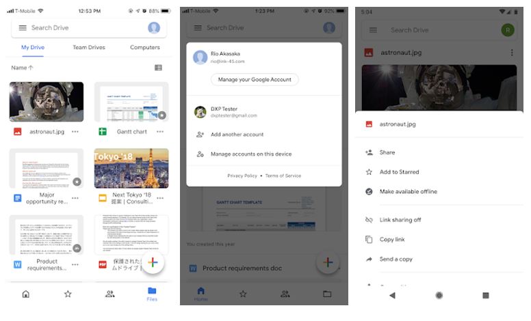
- Home tab will surface the files
- A more intuitive bottom navigation bar
- Expanded search bar
- Team Drives will be now be displayed as a tab next to My Drive in the Files view.
- Switch accounts option moved from the left navigation menu to right.
- Revised actions menu attached to every file and folder


Related Posts
How to create QR codes on Google Sheets for URLs or any other text elements
How to set Gemini by Google as the default Android assistant
Google’s new AI Content Moderation Policy for Play Store Apps
Google Meet now offers Full HD streaming for group video meetings
Googlе and Applе Facе Finеs of Ovеr $50.5 Million for App Storе Violations
Google’s new update allows Android users to delete up to 50 emails at once in Gmail with the “Select All” option