At Google I/O 2017, Google announced a full redesign of the Android Emoji Fonts, which includes a unification of visual style and a brand new design that fosters cultural awareness through diverse and inclusive emoji.
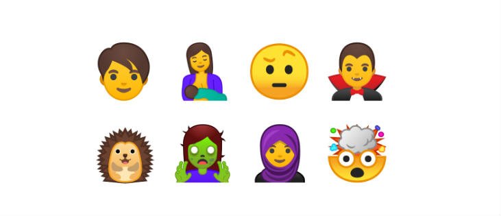
As part of the redesign for Android O, Google is introducing 69 new Android Emoji Fonts which are part of Unicode 10. This new set strives to make emoji more representative by providing gender-neutral representations of people, a woman wearing a hijab, and a woman breastfeeding.
Also See:
Google’s next Pixel XL to sport squeezable frame
Bidding goodbye to the blobs, Google is moving away from the asymmetric and slightly dimensional shape of the container to an easily scannable squishy circle, relying on bold colour, purposeful asymmetry — such as the new mind-blown emoji or the prop-wearing cowboy emoji — and loud facial features to convey emotion.
In the spirit of readability and consistency, the Android Emoji Fonts are built on a single grid. The grid that the company used was a modified version of the Material Design product icon grid. Not Google has ccapitalizedon the grid in three particular ways — unifying scale and size consistency across illustrations, building a consistent set of shapes across the set and facilitating designers aligning various parts of emoji in the correct places (think specific areas for eyes and mouths).
Google also unified dimensionality and angles across sets, opting for simple angles as much as possible — emphasizing two-dimensional views over three-dimensional views to simplify and work with our grid. And introduced three-dimensional points of view in the few cases where the readability of the emoji was unclear.
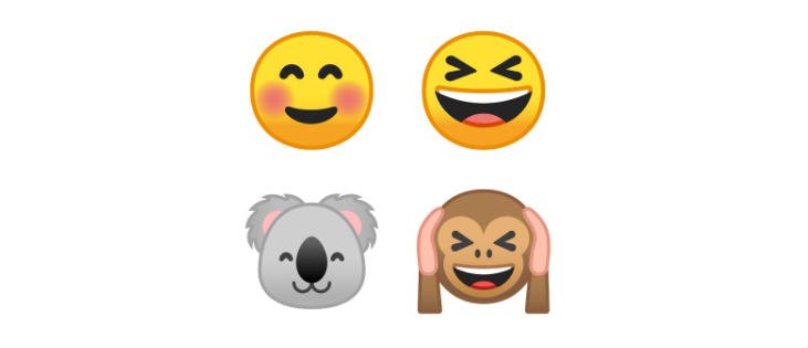
In addition to a grid, the company built a new collection of reusable components for certain categories of emoji. It was also fun to mix and match components between categories, which resulted in some nicely expressive animals.
Related Posts
How to create QR codes on Google Sheets for URLs or any other text elements
How to Download Firefox for Android Without Google Play
How to set Gemini by Google as the default Android assistant
What is stopping smartphone gaming from becoming the next big thing? The problems, and the possible solutions
How to turn off call recording announcements on Android Google Dialer
How to put screenshots in Android phone frame with the Screenshot Framer app